Trading successfully in the forex market is a skill-oriented endeavor, and among the key elements that as a trader you must absolutely possess is the art of picking low-risk entries. To accurately pick these pristine areas of interest, you must first find order within the chaos, in other words, you must develop a blueprint to interpret what the charts are communicating or you risk being lost in an ever ending
unstructured mess when reading price fluctuations.
It’s every traders’ aim to make a sensible judgment call to maximize the number of times one picks the right side of the market, isn’t that true? We then must combine it with a high enough risk-reward to enter what I call ‘the sweet spot’ in trading. In simple terms, that’s our jobs as traders, therefore, it’s plausible to think that discerning the dominant cycle should come high on the list as a major piece of the puzzle before you engage in a trade, right?
In this tutorial, I will walk you through how to read these cycles, which go by the name of “market structure”. My mission would be to provide a frame of reference for you to properly interpret the ever-evolving ebbs and flows under any market condition. For some traders, this guide will be enlightening, while to others it may not tick. Remember, this is just one angle to analyze the market, and by no means the only one, but it serves the purpose of providing that much-needed structure in an otherwise chaotic context.
You will be able to approach the charts in a mechanical way to constantly be in tune with the right context at play, which in its simplest form, comes down to trade trends or ranges. If you respect this model of reading the charts, I can assure you that you will be ticking yet another critical box when it comes to developing a solid analytical expertise when trading. As a result, it will allow you to pick locations to trade off for a low risk and potentially high reward.
The ABCs Of Market Structure
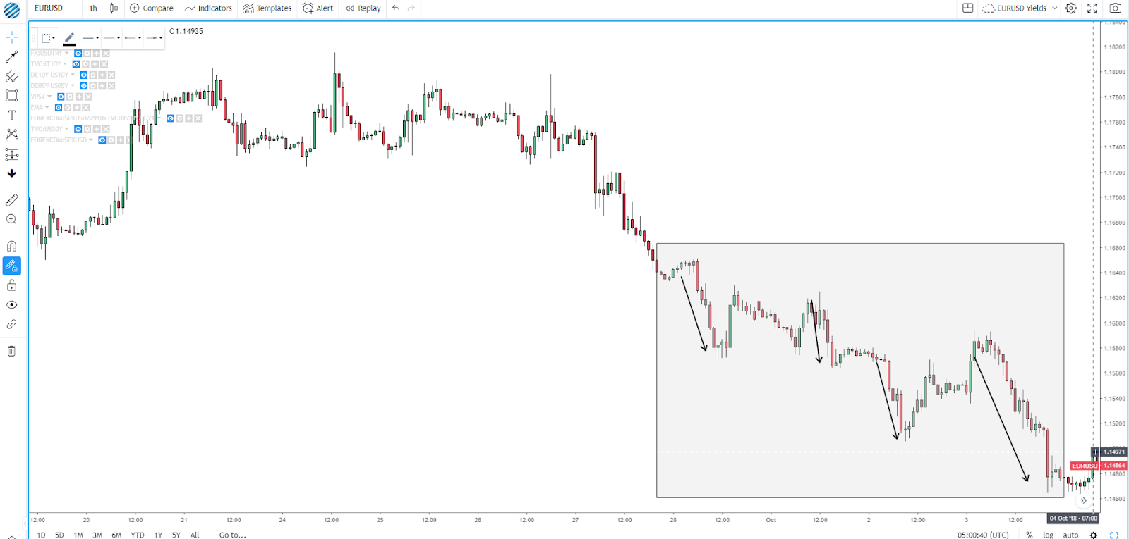
The first principle is the most obvious one, and it states that for a market to be in an active cycle, it’s most recent structure must be one where price prints a high that breaks the previous high (in the case of a bullish cycle). On the flip side, a down-cycle will be established if the latest swings low in price breaks below the most recent low. In this hourly chart below, you can clearly see the EUR/USD in a down-cycle phase on lower lows and lower highs.
Minimum Of Two Closes Beyond Last High/Low
To confirm that a bearish trend or down-cycle is evolving in a healthy manner, not only we need to see the low printed being lower than its previous low, but we also should expect at least two closes beyond that low or support area as further evidence that the market is accepting and building value. Failure to print at least two closes may be a precursor to what’s often referred as head-fake or false breakout, and while the move still holds its merit to qualify as a new low in the cycle, the quality of the leg is poor in nature.
Don’t Lose Sight Of The Forest For The Trees
You must, by all means, avoid the trap of being short-sighted by only sticking to one chart analysis. When conducting your market structure studies, it’s all about building a thesis about a particular direction by finding concurrence from higher time frames down to your trading time frame.
Personally, I wouldn’t recommend using more than 3 charts as your reference or you may suffer from so-called “analysis paralysis”. What this means is that if you are going to find an entry trigger off the hourly, you should then understand what type of conditions are dominant in the immediately higher time frames. The most popular in this case would be the 4h and daily charts.
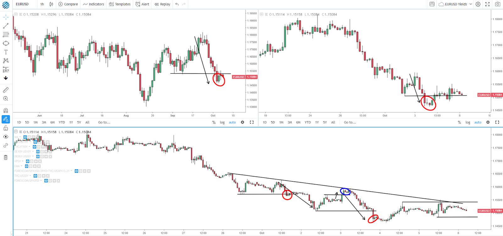
As I illustrate below, notice how all timeframes in the EUR/USD align with the down-cycle? Wouldn’t you think that trading in a context endorsed by traders from higher time frames adds to your odds of picking the direction the market is most likely to head to in your trading timeframe?
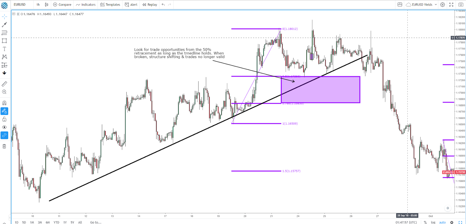
A mechanical rule to apply is the following: If the price in the timeframe immediately above your trading timeframe (the H4 or Daily if trading H1) reaches the 50% Fibonacci retracement of the last valid swing, the position should not be in conflict of the direction of the higher timeframe.
Developing Rules to Validate Cycles
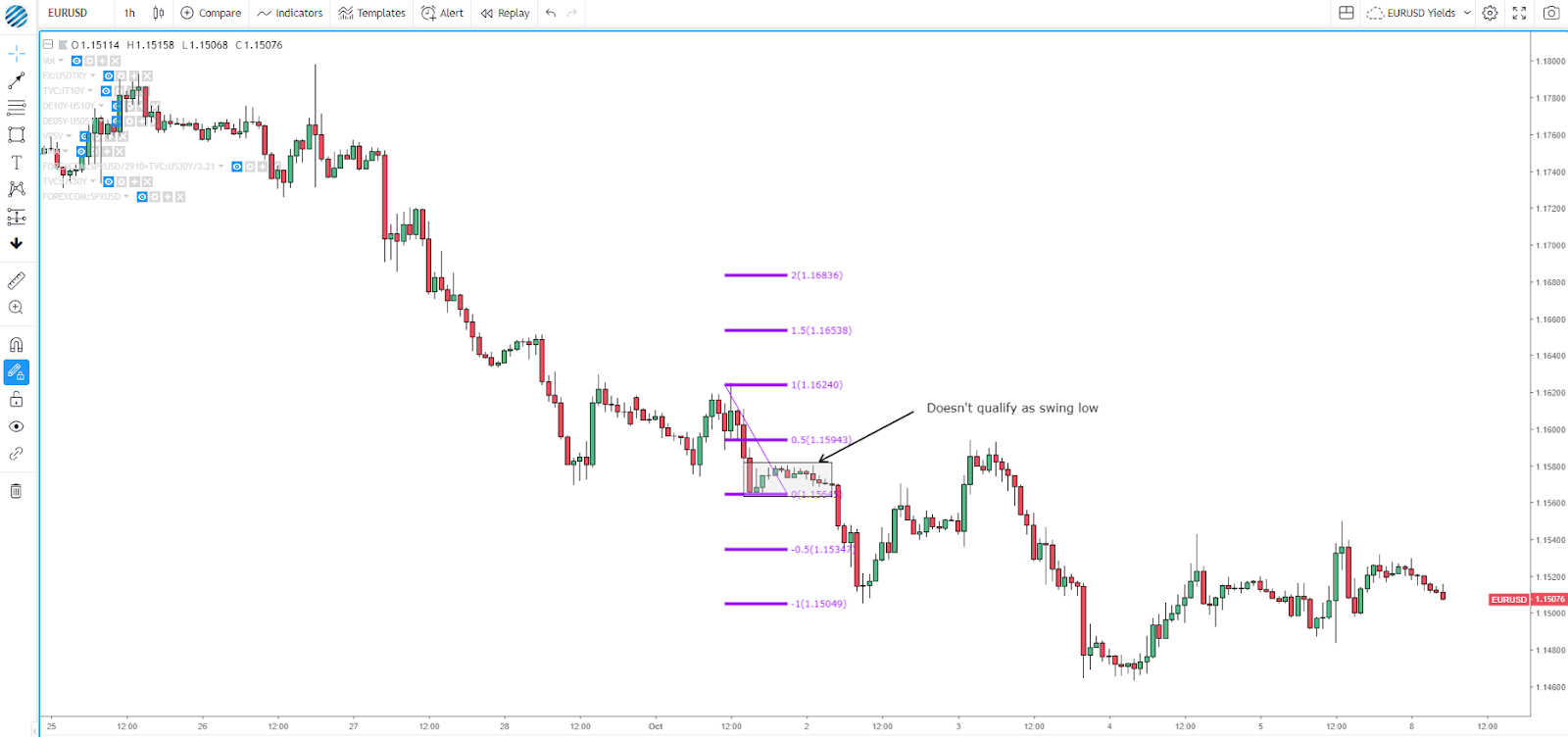
This is a key point that often gets overlooked by market participants by letting too much guessing play a role. When analyzing the charts, how do we determine what constitutes a relevant swing high/low? We need to find a mechanical approach that will allow us to qualify what we understand by relevant swing highs or swing lows in the chart.
As a general rule, if a swing low/high doesn’t make it to at least the 50% retracement of its previous swing, you want to disregard that price movement as not relevant enough to constitute a valid leg. After all, why would you want to consider a leg that originates from a low which doesn’t even make it to the 50% retracement as a point of interest relevant enough? The lack of bounce should be a testament that communicates poor buy-side flows. We only want to focus on the creation of relevant and valid legs that will lead to new cycles and create in the process relevant levels of supports and resistances.
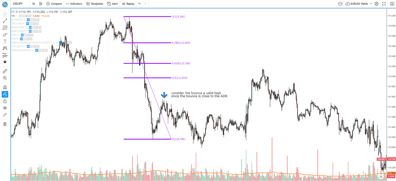
A nuance to apply includes the following premise: If the bounce or pullback from the last valid low or high is greater than the average daily range (if trading the hourly) or 3 times the average daily range (if trading the daily), we will also have the pre-conditions to validate the last swing.
Trendlines: A Visual Representation Of The Cycles
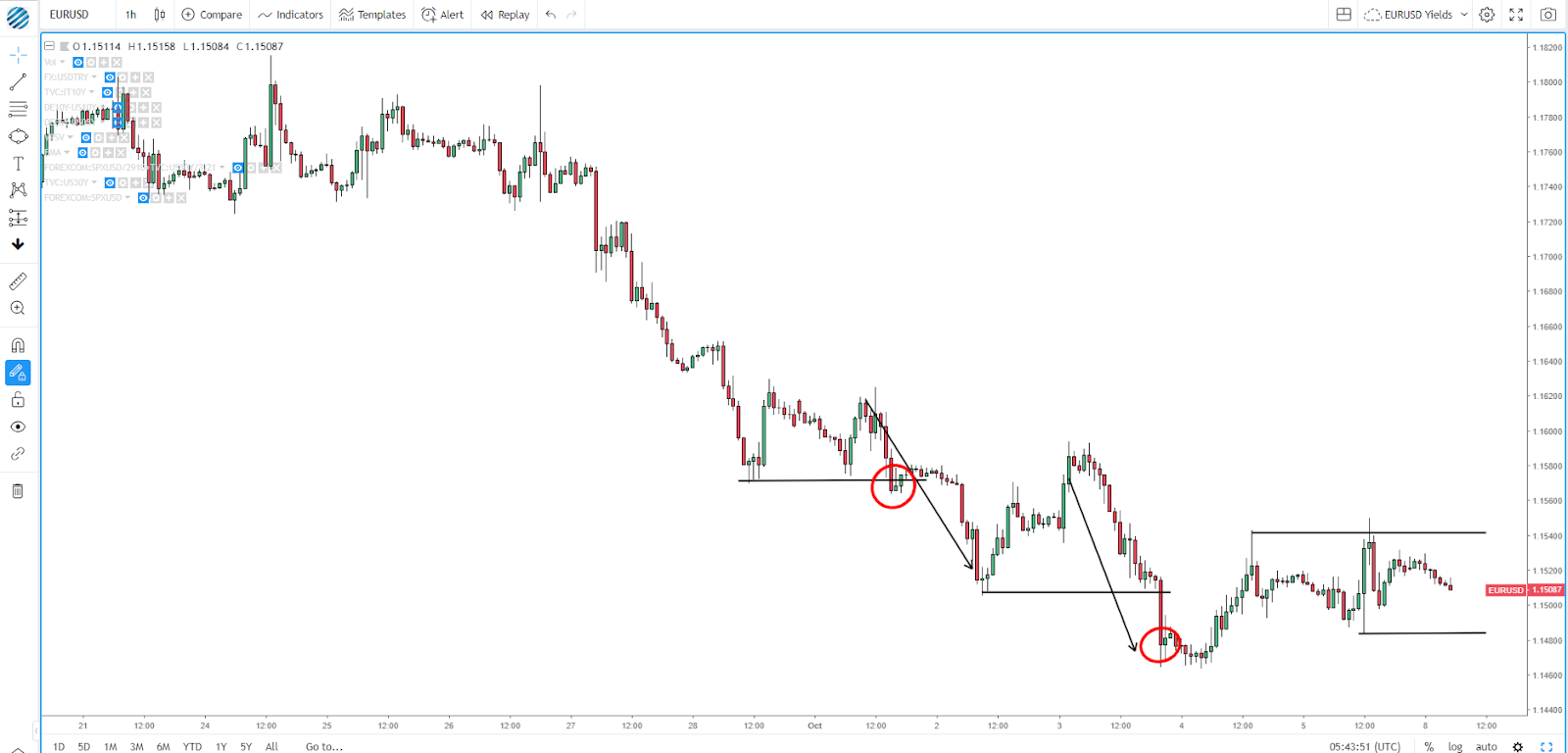
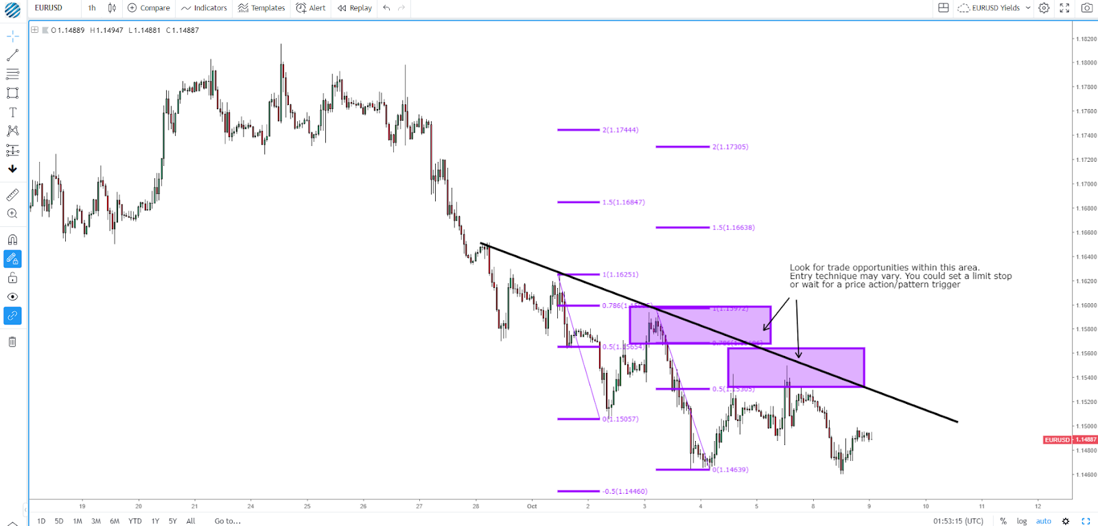
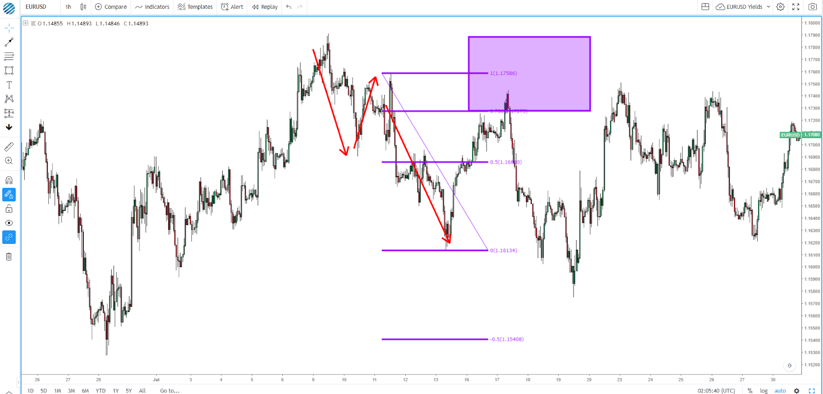
Did you notice in the hourly EUR/USD example how I ignored a higher high printed? Now compare it with another illustration below where it’s drawn — blue circle — with the two closes above supposedly confirming a new up-cycle, right? However, if you were to think about a potential reason why buyers failed so miserably on the attempt, you wouldn’t go wrong if you are thinking about the conflict against higher time frames (pointing down). However, there is another rule of thumb you must incorporate. If on a downtrend we make a higher high as in the case of the EUR/USD, but this high fails to break the descending trendline, be extremely cautious as more often than not, it can easily lead to a quick reversal in line with the dominant cycle. The power of a trendline lies not only in its capacity to provide an entry trigger but as a blueprint to help you understand the type of dominant market flows and potential locations to engage upon your own models.
Transitions: From Trends To Ranges
We’ve come to the point in the market structure where the dominant flows start drying up due to increased profit-taking, change in ebbs and flows due to removals of liquidity, intervention by market-makers, economic data-driven moves, etc. While in a down-cycle, the interpretation of the chart is straightforward, when is it that we can say with certainty that we’ve transitioned from a trend into a consolidation?
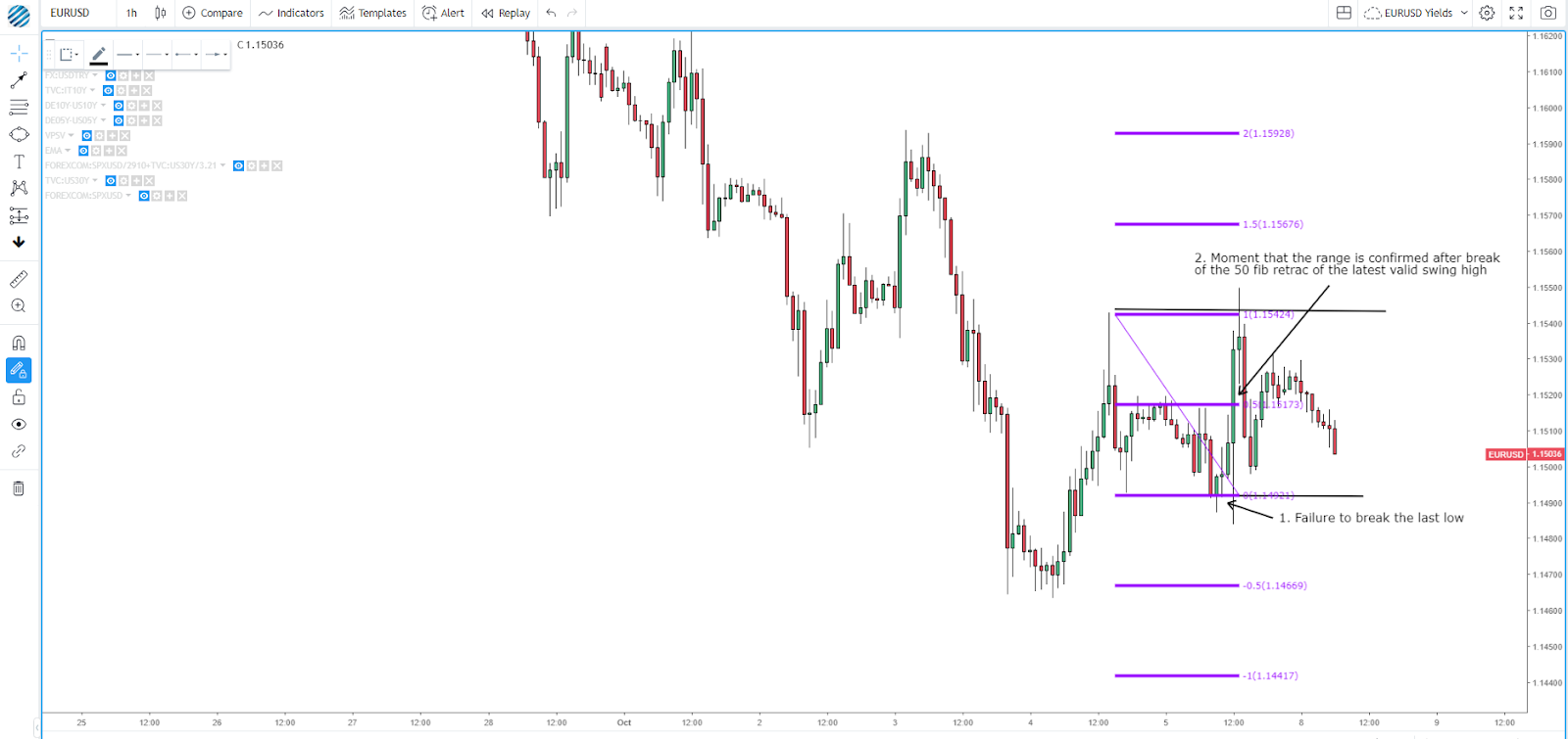
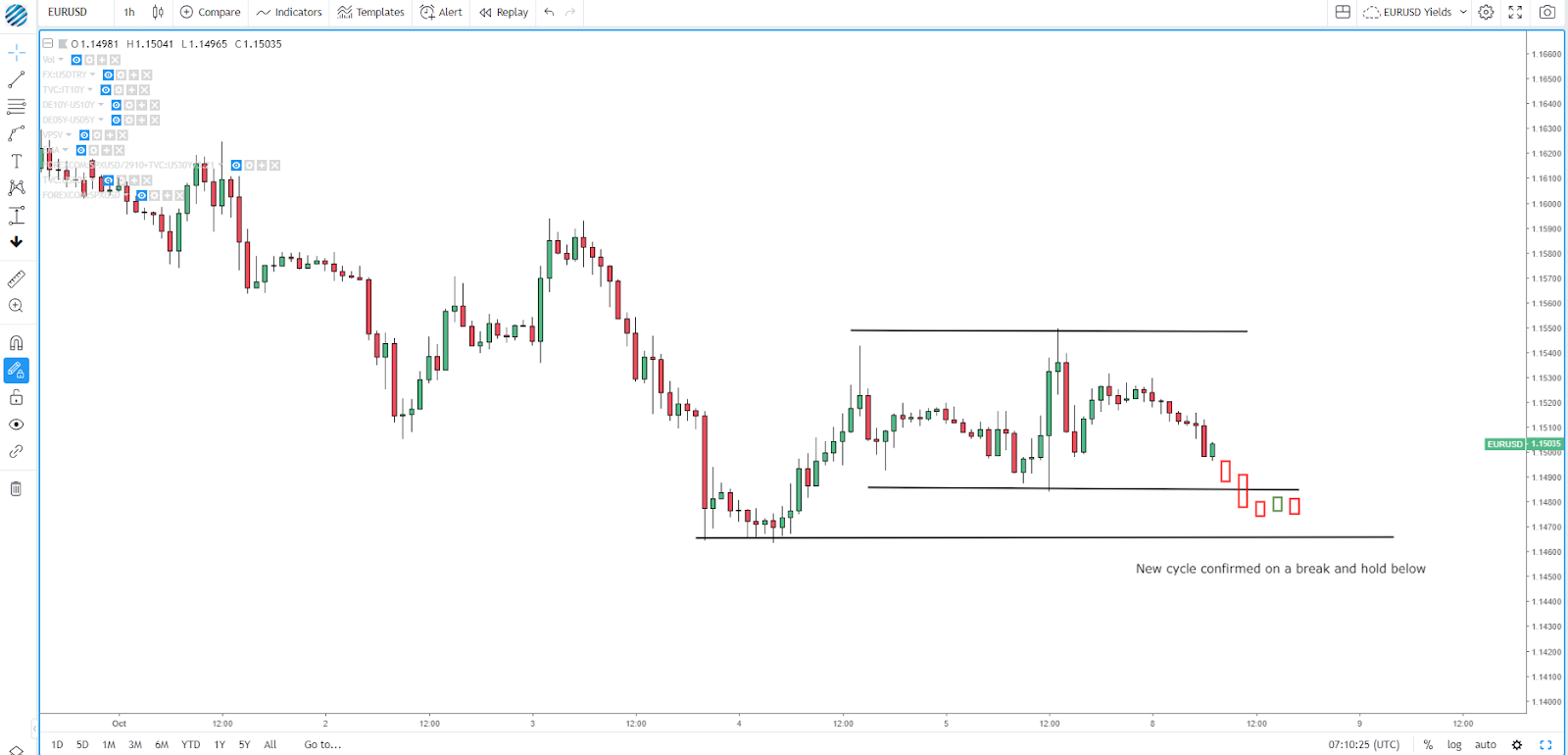
In the case of the EUR/USD hourly chart, firstly, we must see a failed test of a valid low (Oct 5th). Secondly, a recovery above the 50% fib retracement of the most recent swing high would confirm that we have entered a consolidation phase, which would last until the most recent valid high or low is broken, with at least two closes above/below the level.
In this context, don’t forget that the consolidation is within the context of a down-cycle not only in the higher time frames but also on the hourly. Until buyers manage to break and hold above the latest valid swing high, which doesn’t occur, the risk remains to the downside.
Magnitude Of The Cycle
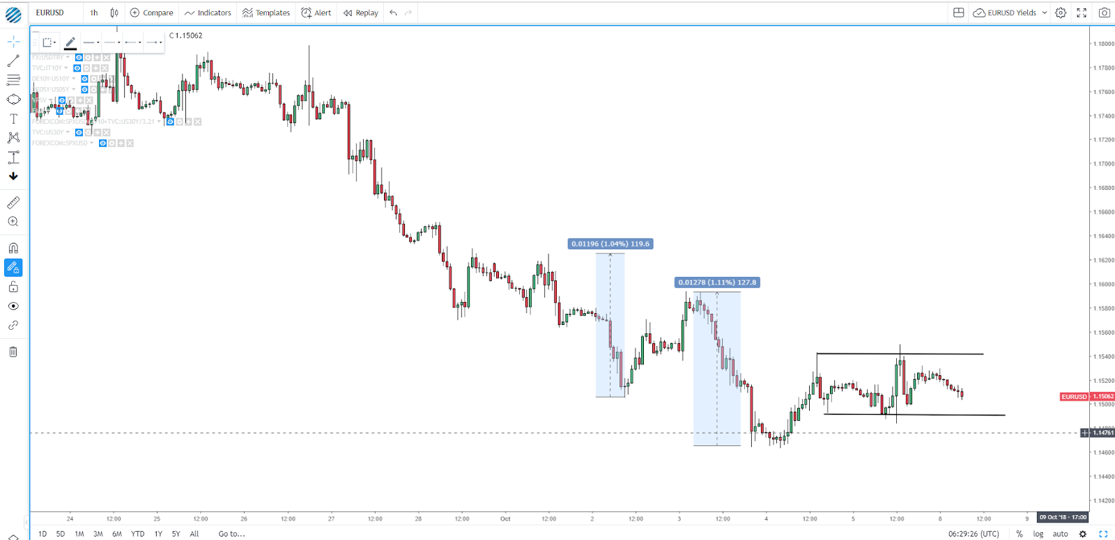
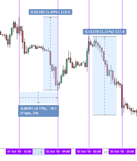
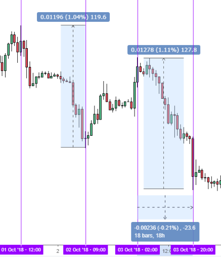
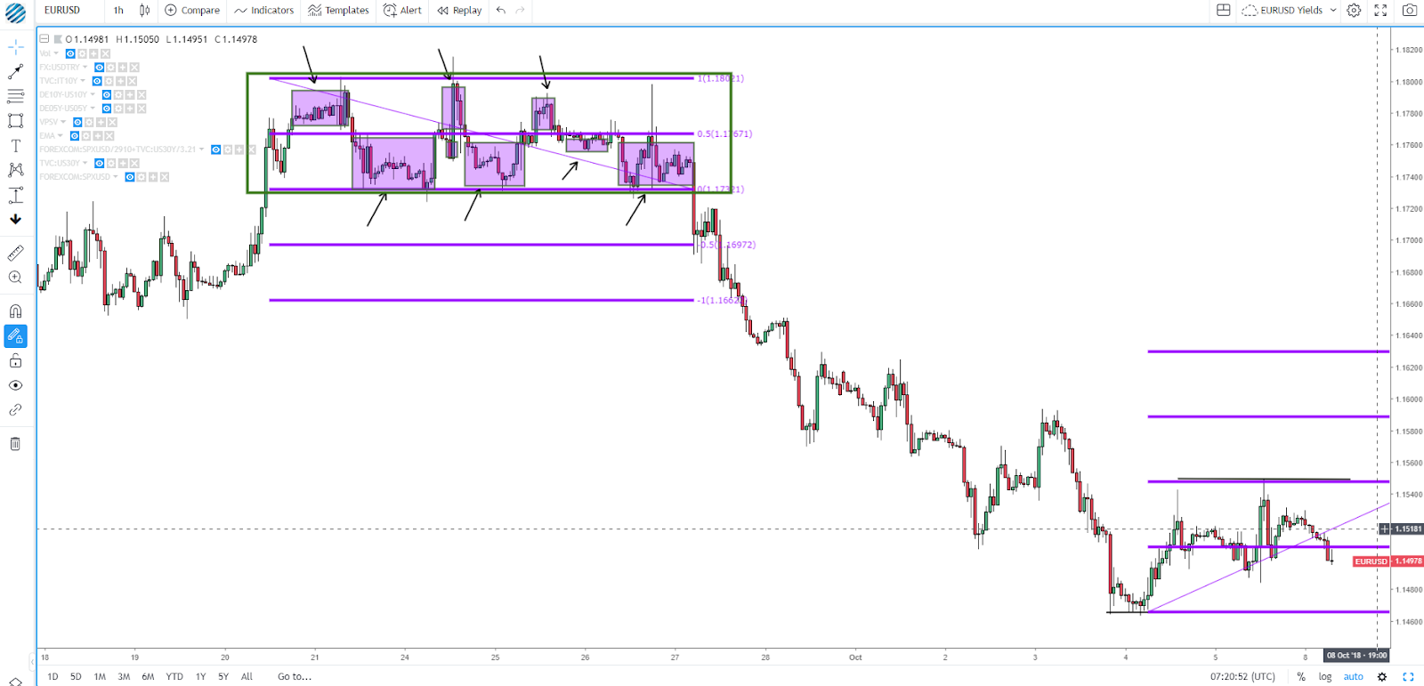
Another major clue that will help us determine the health of the cycle is the type of progress made by the dominant side in control of the cycle. In this section of the analysis, we need to ask the following question: Are the new legs in the cycle increasing or decreasing in magnitude? Despite having entered a period of consolidation in the EUR/USD hourly chart, the latest swing low, if we were to measure its extension from the last high to the newly established low, saw a slide worth 128 pips vs the previous leg down, which only achieved a move of 120 pips. This carries an important message: The most recent flows communicate that sellers are increasing its commitment on each new cycle low (greater supply imbalances), therefore, this is yet another clue that the risk should stay skewed to the downside.
Velocity Of The Cycle
When it comes to the distance the price moves, the magnitude is only ½ the equation. The other ½ has to do with the velocity of the move or the speed. Was the new leg created after a fast and impulsive move? Or did price make a new low or high with the movement being sluggish, compressive and taking too long to form? A good rule of thumb is to count the number of candles it took to achieve a new leg. In the illustration below, you can see how it took 21 hourly bars to achieve 120 pips vs 18 bars to net 128 pips. Bottom line: The cycle continues to prosper in a healthy manner.
Projection: Targets In A New Cycle
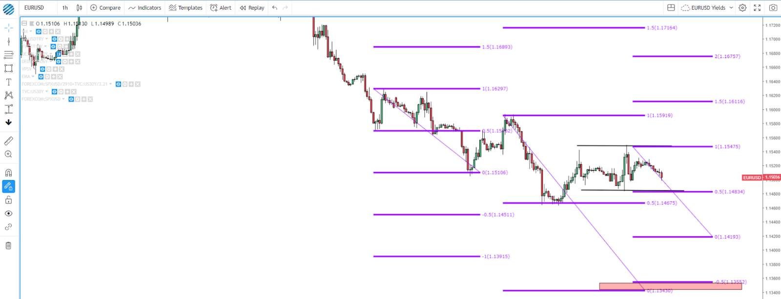
By far, the most accurate measure I have found to set targets (partial or full take profits) when trading cycles is to measure the 100% fibonacci projection from the most recent valid swing high to its low. Note, there will be enough cases when events outside one’s control will cause prices to fluctuate erratically and not achieve these targets. Don’t forget to also factor in potential hurdles in the form of higher time frame support/resistance areas. You should see these levels as simple guides but far from certain outcomes. If the cycle continues in the expected direction, you will start to appreciate the power and usefulness of these targets to consider taking profits or trailing stops in hope of an ever larger yield in your trade.
In the case of the EUR/USD, notice how the target at 1.1510 was reached almost to the pip before sellers took profit? As the market structure stands, upon a breakout confirmation of the range, the first target should come at 1.1419, while a breakout and confirmation of a new cycle low by two closes sub 1.1467 suggests a larger projected target of 1.1430, which would come within striking distance of the target 1.1355 based on the range breakout. I’ve drawn in a red rectangle where these targets come at. It is at these levels where one should expect a potential exhaustion of the downward cycle.
Cluster Of Levels Nearby
Another must-do exercise for every trader to perform is to draw the most immediate lines of support and resistance — at least 2 up and 2 down — based on a top-down analysis. They should be obvious to spot.
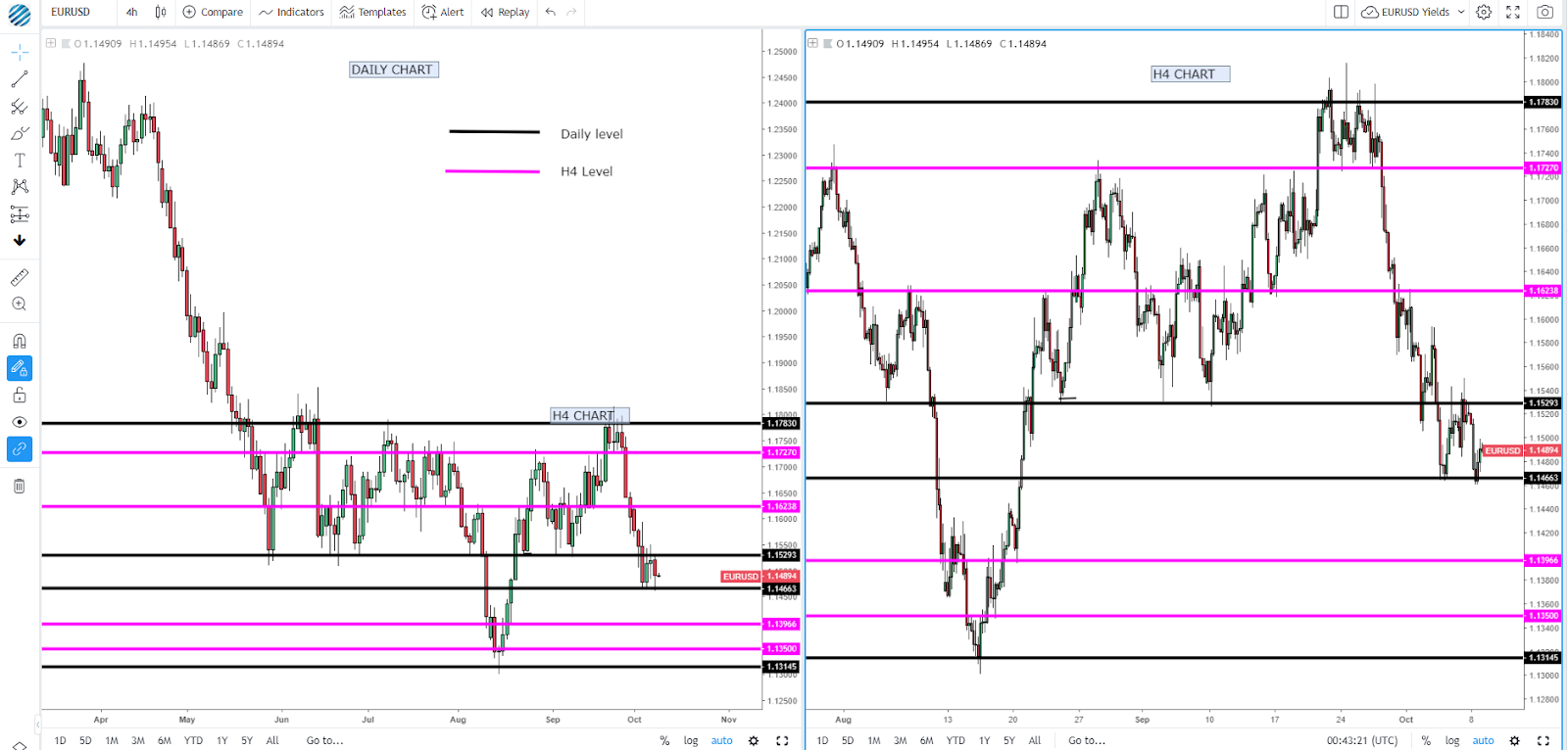
The considerations to be given when selecting these areas include the number of times the area has been tested (minimum of 2 times), type of reaction away from this area (the stronger the more relevant), time frame (the higher the timeframe the more significant the level is). Below you can find an example in the EUR/USD, where I’ve drawn the two most immediate levels of support and resistance in the daily and H4. What this means is that if you are going to find trades off the H1 chart, you must be aware that once the price reaches these areas in the higher time frames, a potential disturbance of the structure in your trading time frame (H1 in our example) may occur, hence you must be prepared by anticipating this potential outcome. The mark up of levels in your chart allows you to do precisely that, to expect a potential turnaround.
Additionally, the clusters of levels from your trading timeframe must also be marked. If you’ve followed me this far, you will by now understand that a new cycle would be confirmed if we can break and have two hourly closes outside the range, right? However, what if we break the current range but we are faced with another recent low immediately ahead as in the case of the EUR/USD (example below) at 1.1465? If the distance is relatively narrow — about 15/20 pips in the EUR/USD — a safer approach is to wait until a breakout of the most distant level in that cluster of support areas, which would be two closes beyond 1.1465 to confirm the down cycle. Essentially, when this situation occurs, what you probably want to do is to expand the size of the range by that extra 15–20 pips and wait for a resolution outside. Note, the 15–20p in the EUR/USD is just a personal preference. You can work out your own personal magic range based on the ADR of the pairs you are trading.
How To Trade Market Cycles
The real power lies in the congruence of factors from a top-down approach, aiming to have as many aligning in your favor as possible. In the example of the EUR/USD exercise, the down cycle in the hourly had the backing of the H4 and daily cycles as well, which undoubtedly reinforces the chances of picking the right direction to trade. Now, does this mean that the bearish market structure in the hourly will be respected? Not at all. Remember that each individual trade is just a random event within the context of an exploitable edge. However, by conducting the proper market structure analysis, you do obtain that edge in terms of the location to engage that can offer a relatively low-risk entry for a potentially much larger yield.
So, how can you go about trading these cycles?
First and foremost, assuming you are trading off the hourly chart, you want to make sure to trade also in line with at least the immediately higher timeframe cycle (H4), and ideally both (daily and H4). You also want to double-check that the hourly market structure is trending as per the rules of two closes beyond the last valid swing low/high to confirm a new leg in the cycle. It’s important that you then check the absence of nearby cluster levels from higher time frames or economic data releases that may disturb the structure. Next is to make sure that the price remains guided by a descending or ascending trendline. Lastly, and this point is key, pay attention to both the magnitude and the speed on the creation of a new cycle.
As a general rule, regardless of the type of cycle, I personally don’t see enough risk-reward value if one engages ahead of a 50% fib retracement. If we are in a healthy cycle with lower lows, decent magnitude moves and no obstruction of higher timeframe levels, it makes the 50% fib retracement a great location to start looking for trades based on your ideal entry technique. Some traders may prefer to set limit orders at this levels with a stop a few pips away from the most recent high/low (this approach would make the most sense if the underlying trendline is still respected). Others may prefer a confirmation trigger such as the break of a trendline, a particular pattern (pennant, triangle) or a specific price action formation such as engulfing bars, pin bars.
Whichever way you approach your trades, it should nonetheless be from having an inner peace of mind that the area you are looking to trade from holds value on the basis of decent risk-reward prospects. Alternatively, and this is subject to one’s discretion, I personally remain more cautious to enter at the 50% fib retrac and tend to wait for either the 78.6% fib retrac or a test of the previous valid swing low/high in the case that we had a break but we never confirmed the cycle by having two closes past the level. If the cycle is confirmed but the magnitude is nowhere close to what would qualify as healthy, be more cautious trading around the 50% (wait for trigger).
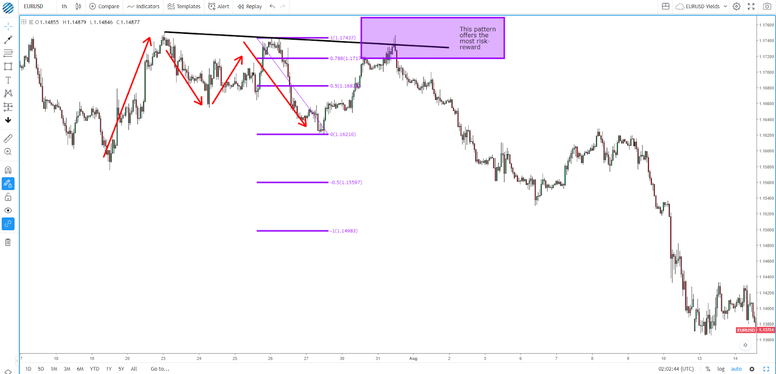
Personally, a great pattern for a potentially large risk-reward is to be on the lookout to trade a retracement to at least the 78.6% Fibonacci within the context of a strong and healthy cycle. This trades tend to offer the most bang for your buck, even if you must be patient for them to come about.
Examples/
How To Trade Ranges
When the price starts trading confined in a box or consolidation phase, we know this is a period of reassessment before the next directional move. Unless a breakout occurs, the only area where you really want to engage as part of a range include the upper or lower edge. A useful exercise to conduct every time the price fluctuates within a range is to draw a 50% fib retracement, and start to observe what side of the range the price spends the most time at. Is is the lower half or the higher half? The side where price usually spends the most time tends to be the most vulnerable for a price breakout. See below a recent example when the EUR/USD entered a range between Sept 21–28. Notice how the attempts to trade above the 50% fib retracement of the range were consistently rejected while price would accept below?
Conclusion
By now you’ve hopefully come to grips about the importance to keep your charts neat and clean, away from unnecessary indicators while embracing the power of reading market structures in a proper way. You have also gained enough knowledge to ultimately, through your own analysis based on a rules-based approach, find these low-risk areas to enter trades.
While some degree of subjectivity will always be required, this tutorial offers you a roadmap from which to find the order within the chaos. You must become the primary conductor of your own orchestra as the forex symphony keeps playing. The right interpretation of market cycles will allow you to make sense of the music being played at all possible levels.